  Versions
of well-known movie posters that never made it to print Versions
of well-known movie posters that never made it to print
by Billy 'Hollywood Swingin' Ingram III, Esq. Thousands dream of being a movie star or film director, but does anyone actually aspire to become a movie poster artist? When a designer creates a striking movie poster he or she does it against all odds. The limitations inherent in the medium are severe. For instance, something as simple as the size of the letters in the billing at the bottom of the poster are contractually tied to the size of the letters in the film's title, which are tied to the size of the letters in the lead actor's name above the title. Even the size of the star's heads and how they relate to each other can be contractually spelled out. Here are a examples of how movie poster designers solved the problems and limitations they were faced with. |
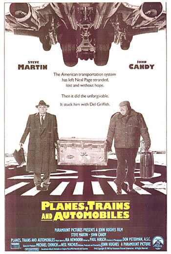
Planes, Trains and Automobiles
|
|
|
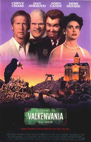
ValkenvaniaDon't recognize the title? That's because the film was retitled at the last minute to 'Nothing but Trouble'. Still don't recognize the title? The movie was a big bomb. This poster design could be used as a template for so many movie poster designs from the eighties to the present. Take the horizon of a city (preferably New York), place it just above the title and billing, then place movie star heads in the sky and you have an instant big studio movie poster Place heads in the sky at sunset and you have a romantic picture, place your heads in the night sky for a serious drama. Throw in an explosion, big ball of fire or a runaway car and you have an action picture campaign! I don't know who designed this gem, except for the title and a few other minor changes, this was pretty much what the final poster looked like - a lot better than the movie itself. The painting on this poster is by highly respected movie poster illustrator Dave Christiansen. |
Prince of Tides
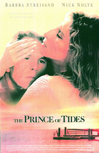
Heads in the sky again!
Ms. Streisand is famous for micro-managing her projects and she has complete control over all advertising and publicity for her films including the movie posters.
This isn't unusual, most major stars have this same clause in their contracts now. Over at Paramount, when Tom Cruise saw a poster mock-up he didn't like for 'The Firm', he scrawled "Over my dead body!" across the artwork and sent it back to the agency.
Meanwhile at Columbia, Barbra Streisand was developing the poster for 'The Prince of Tides' and she kept asking that her head get bigger and bigger on the comps. Of course, as her head got bigger, so did Nick Nolte's. Finally someone looked at this mockup and said, "It looks like Barbra Streisand and her pet head!"
Good taste won out in the end tho, and the final poster was a superb piece. (It was decided that the example at right looked a little too much like a feminine hygiene ad - a movie poster no-no!)
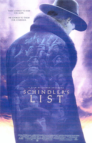
Another rejected design...Schindler's List
The final poster for this film was nice, as were so many of the bold, experimental designs that were passed over in the elimination process. Universal went to great lengths to get just the right campaign for this unique film, and everyone who saw the comp at left thought it told the story beautifully.
(Right: art director Jeff Kerns in 1992)
The art seen on the left was created by art director Jeff Kerns - and brought to life by the incredibly talented designer Kirsten Conran.
Kern's painstaking eye for detail and frequent use of symbolism are evident in his large body of work and in these examples. Kerns is by far the wittiest person I've ever met and a world class musician - his instruments being the people he works with.
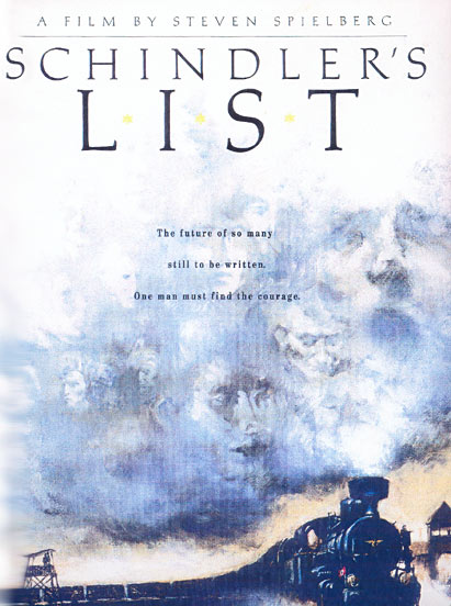
Another striking comp (at left, executed by painter Michael Husser) would have made quite an impact in the theaters if it had been chosen. Unfortunately, this small, lo-res image doesn't do justice to artist Husser's powerful oil painting.
Moonstruck
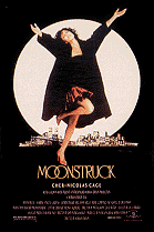
The finished poster for Moonstruck (at left) is another one of those classics that everyone remembers. In fact, it won the award for best movie poster that year, another home run for the Tony Seiniger shop.
That picture of Cher on the final poster (from a location shoot in Central Park by Annie Leibovitz) is actually three different photos combined. The head, the torso and arms, & the skirt and legs all came from separate shots.
Designing movie posters for a living in the late eighties/early nineties was very much like being back in kindergarten. Before computers became practical for daily graphics use, a typical poster designer would spend all day painting, drawing, xeroxing, rubbing down type, cutting out pretty pictures of movie stars and pasting them together with spray mount into a collage - all the while dealing with a room full of spoiled, petulant brats fighting over the glue and pictures. It was fun.
This also-ran for 'Moonstruck' (at right) has some of the same elements as the final poster but... why is Cher up in the sky, kicking the logo? More importantly, why is the moon moving so dangerously close to the earth? File this one away for the science-fiction sequel: "MoonstrucktheEarth"!
NEXT: PAGE TWO:
More lost movie posters
Unseen designs for 'Predator', 'JFK', 'Mr. Jones', 'Boomerang', and more.
page 1: Unseen Movie Posters
page 2: More Lost Movie Poster Designs
page 3: Son of Unseen Movie Posters
page 4: Yet Again, Unseen Movie Poster Designs
page 5: Movie Trailers of the 80s-90s
Page 6: Inside Seiniger Advertising - 1988


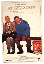 That
comp is a great high concept treatment, telling the story with strong
silhouette value, important for a quick read. Movie posters have to
tell their story in a glance.
